
Richer sounds
rebranding project
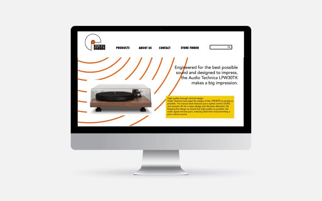
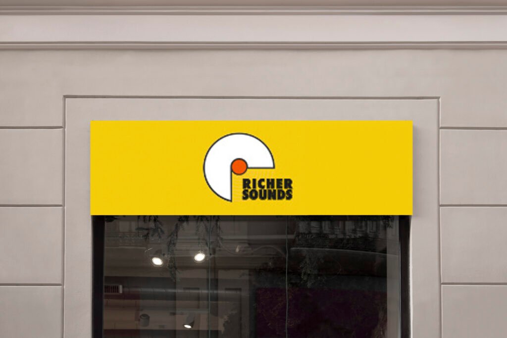
As one of the UK’s most storied and respected home entertainment retailers, Richer Sounds built its reputation on grassroots passion and pure audio heritage. This rebrand bridges that classic legacy with a sharp, contemporary edge fit for the 21st century, placing the massive resurgence of vinyl squarely at the heart of the identity. The logo features a sleek, lowercase white ‘r’ sweeping around iconic sound-wave ridges that evoke the continuous motion of a spinning record, revolving around a central red core as a direct homage to the original brand. By embracing a rich vintage mustard palette and confident, tactile typography, the design recaptures the effortless cool of the 1970s, an era when hi-fi culture was at its peak and analog warmth truly reigned. The result is a vibrant, sophisticated identity that feels both authentically nostalgic and refreshingly modern, delivering a warm, approachable brand experience that brings classic audio culture back into the spotlight.